Wednesday, December 9, 2009

Week 9 Assigntment

The following map represents the percentage of Black population per county in the 2000 Census for the United States of America. We can clearly see a heavy population occurring in the southeast portions of the United States. Slight larger populations do occur in scattered parts of the country, but the greatest percentage in this South-East corner. Generally, when one considers the Great Southern Tradition of the African American Race, one does not truly grasp the population in that region. The percentages in this region are far different compared to the rest of the country than anyone would expect, and a map allows the audience to truly visualize this difference.
The trend seen here in the representation of other Races in the United States is very intriguing. One would initially expect the largest counties to have the greatest diversity, but this map clearly shows a major trend of the Western half of the United States being much more heavily diverse. One logical explanation for this trend could be dated back to the beginnings of this country. The Eastern part of the country was initially the only populated parts of this country. This would lead to different Races moving to the free land Western frontier.
This map demonstrates the distrubution of the Asian population in the United States at the time of the 2000 Census. As is clearly shown, the Asian population in the United States is focused primarily around the Pacific Coast of this country. This trend is most likely caused by the fact that the Asian countries are located on the other side of the Pacific ocean from the Western Coast of the United States. One would expect populations from the Asian continent were much more likely.
The Census maps allow us to take public data and create an image to represent a certain aspect of that data. This data allows us to differentiate different populations as seen in the maps above. Race is only one of many, many subtopics that can be used to visualize this Country of ours in a completely different way. We are used to seeing this country as a whole represented equally. Maps, such as the ones above, show the non-random trends that are occurring in the United States in terms of populations.
Again, the idea of representing data to best suit what the presenter is trying to inform the audience is a crucial component of ArcGIS. Yes, this program is quite complicated and takes a while to learn how to use it efficiently. However, once one learns how to best incorporate information into the maps in a successful manner, one can use the wonders of ArcGIS to represent unlimited amounts of information. ArcGIS has proven to be a very intriguing program with a vast array of possibilities.
Monday, November 23, 2009

Assignment Seven

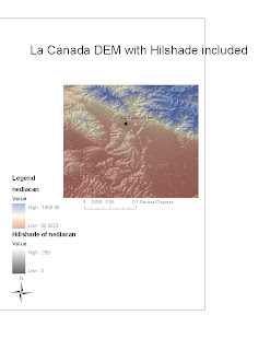
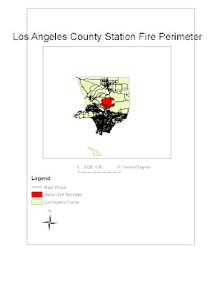
As most fire do, the Station Fire of this past summer had severe geological effects on the Los Angeles County region. For this assignment, I chose to look at the effects these fires had specifically on La Canada. As devastating as the fires were for the residents of La Canada, the after effects of once the fires had been contained were equally as problematic. The build up of debris following the fires leads to a potential risk come the present Winter time in the form of mudslides. Heavy rainfall can lead to severe mudslide damages as the level of debris scattered in the San Gabriel Mountains from these fires are not likely to stay in their current position. In this assignment, I look at this potential of mudslides on the La Canada region and the science behind the effects.
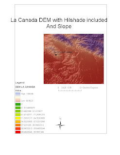
Scientifically speaking, mudslides are when high levels of debris, such as rocks, water, and tree branches, flow at high velocities with the potential of causing harm to both roadways and buildings. Clearly, the after effects of a massive fire leads to the build up of such debris in excessive amounts. Another major contributor to the mudslide problem cause from the Slope in the region of question. The greater the slope of the region, the greater the gravitational pull on the debris leading to a faster flow of debris. The region of La Canada borders the San Gabriel mountains. As seen in the map, this region features substantial slopes which will certainly have an effect once a heavy downpour of rain enters Los Angeles County.
As seen in my contrasting images of the La Canada region, the slopes are extraordinarly large in this region. The San Gabriel mountains cause such a high degrees in terms of slope in these regions. I included the hillshade effect to demonstrate again the mountainous terrain on the La Canada region. These factors contribute to what will be a dangerous rainy season ahead for the residents of La Canada.
These residents have had to prepare for the effects of the mudslide imediately after overcoming the pain set in by the Station Fire. It is projected that the effects of the Station Fire will continue in the La Canada region for up to 5 more years. The unfortunate geography of the region of La Canada leads to much more potential damage.
I chose to make my project regarding the mudslide damage potential because, as we have just learned about DEM and Slope analysis, I felt very comfortable in presenting information to demonstrate the effects of the Station Fire. Once again, GIS is able to present an image with the written words that can aid any audience in understanding the effects of the Station Fires.

Works Cited
Knoll, Corina and Zavis, Alexandra. "After the Station fire, a new danger: mudslides" Los Angeles Times 9-17-2009

Seib, Al. "Mudslide damages six homes, closes roads in La Canada, Flintridge" Los Angeles Times. 11-13-2009

Shaffer, Jen. "The Science of Slides: A Primer on How Debris Flow Works" Lodging and Landslides: A clear cut Controversy. Wildfirenews.com (Accessed 11-23-2009).

"La Canada, Flintride" Wikipedia.com (Accessed 11-23-2009) [http://en.wikipedia.org/wiki/La_Ca%C3%B1ada_Flintridge,_California]

National Map Seamless Server (Acessed 11-23-2009) [http://seamless.usgs.gov/website/seamless/viewer.htm]

Los Angeles County Enterprise GIS (Accessed 11-23-2009) [http://gis.lacounty.gov/eGIS/?s=station+fire]

Monday, November 16, 2009

Assignment Six

The region I have selected for this assignment is the Santa Barbara Country region. I chose this area because on my many drives up North to this county, I always droves alongside the coast on one side and the Santa Ynes mountains on the other. I recall this being a very scenic drive and I enjoy it every time I take part in it. I thought it would be a nice region to select due to the vast differences in elevation between the oceanfront and the mountains, especially as they are in such close proximity from each other. The region of my map is between the following four positions on the map. The East border is located at 34.623 decimal degrees. The West border is at 34.376 decimal degrees. The North border is at -120.142 decimal degrees, and the South Border is at -119.534 decimal degrees. The elevation peak at the top of the Santa Ynes Mountains in my specific chosen region is 1541.4 meters. The low is at sea level with 0 degrees of elevation.

(North Arrow rotated to faced left for accurate depiction)


Monday, November 9, 2009

Assignment Five


The three dimensional structure of the Earth has caused significant issues throughout history. Yes, the globe is an applicable tool in order to reference this 3-d structure. However, carrying a globe around is clearly not feasible at all times. When referencing maps, whether that be in hand or on a computer, a two dimensional representation of the Earth is most common. This causes an issue has representing a three dimensional structure on a two dimensional surface leads to distortion in the projected surface of the earth. This assignment allowed us to look at multiple formats by which these two dimension projections are formed and the differences between each format.


Although each projection presents the earth in a different way, they are all useful to us for visualizing the earth. In this assignment, I chose six different projections to look at, each with its own distortion. When looking at Equal Area maps, I chose the Cylindrical Equal Area map and the Mollweide Equal Area Map. Equal Area maps preserve areas of the Earth in the 2-d projection. The Cylindrical Equal Area Map uses a cylinder as a developable surface of the Earth. The Mollweide Equal Area Map specifically decreases angle and shape preservation to increase the accuracy in area representation. As seen in the distances between Kabul, Afghanistan and Washington, D.C., these two map projections of the same larger category have a 3,019 mile difference in what each represents for the total distance of the cities.
For the Equidistant Map Projections, I chose the Equidistant Conic Map and the Sinusoidal Map. Both of these Equidistant Maps preserve distances from a set point. The Equidistant Conic map is a standard equidistant map that uses the cone as the developable surface. The Sinusoidal Map keeps the distances along the parallels of the graticule intact. The differences in distance between the two cities on these maps was 3,051 miles. For the Conformal maps, I used the classic Mercator Projection and the Gall Stereographic Map. Conformal Map Projections preserve the angles in the local spaces of the Earth's surface. Both maps create right angles when meridians intersect parallels. Stereographic maps differ as they keep the shapes of circles preserved. The distance difference between the two Conformal Map Projections I chose was 3,039 miles.

(Information for the previous paragraphs was found from the recommended Wikipedia source for us to look at)


As seen by these projections, not only do different types of map projections differ vastly in the information presented, but even maps of the same category differ as seen by the average difference of around 3,000 miles. Clearly, these projections are not perfect representations of the Earth. Although is the case, these projections are still full on important information for many fields, such as Science, Navigation, Meteorology, and much, much more. The key is to use the specific projection that best suits the focus of one's study, while remembering the information is not exact.

Assignment Five

Monday, November 2, 2009

Assignment Four: ArcGIS


My ArcGIS experience:

Professor Shin was not kidding when he said learning ArcGIS is a process that must be handeled carefully. Learning how to use the software created a high level of stress as it is quite complicated. In the long run, the benefits of learning such a difficult application will prove to be quite useful.

My first few tries the tutorial included many mistakes. My maps did not come out looking at all as those in the tutorial. of course, this led to rising levels of frustration. There were several times when I had to put everything on hold and convince myself it will be a smoother process at another point. This mindset led to several breaks in between completing the project.

Due to my inability to succesfully finish the project in one sitting, I attempted to use the remote desktop software at home. This had its pros and cons. It was nice to be able to use ArcGIS at home, but it did appear to be slower than it is when on campus. Though I did accomplish a few exercises at home, I had to come back to UCLA to fully finish this weeks assignment. Luckily, it all seemed to make much more sense this time around.

ArcGIS became a useful software for me once I understood the procedure. This led to a deeper understanding of the potential of ArcGIS. Yes, it is difficult to learn, and many steps must be taken for a simple task. However, in the long run, the softwares ability to create layer upon layers of information in an easily presentable way makes it all worth the initial struggles. This ability will allow individuals to create a presentation, as seen in the tutorial, to accomplish significant obstacles in life. Any argument is advanced with visuals, and ArcGIS is the perfect way to professionally present such arguments.

Saturday, October 17, 2009

Assignment Three


View Dui Checkpoints Los Angeles in a larger map


For My Map, I chose to make a map of DUI checkpoints in the Los Angeles area over the past 6 weeks as listed on sources online, such as DUIblock.com. On the map, I made the DUI checkpoints visible as a red danger points. This, as the creator of the map, was my input into the map regarding the feelings I believe one would have if entering such points. Along the same line of this idea, I drew road directions avoiding these points in Green to give the notion of a less distressful ride home. I have include pictures of UCLA and LMU in certain points, and have posted videos. My videos encompass two sides, as there are two comical videos regarding DUIs and one serious advertisement against drunk driving.

My map displays the positives and negatives of Neography. A major negative is clearly seen in that my map aids people disobeying the law to get away with their dangerous actions. This is just one of many possible ways user created maps could be used to advance criminal activities. A positive of my map can be seen if this map is simply used to avoid traffic congestion provided by such checkpoints.

Another issue provided by my map can be seen in the dependability of my information. Due to my map, one may try a different path home that in fact has a new DUI checkpoint that has moved from a previous point on my map. As the creator, am I accountable for this? At a certain point, inaccurate information posted by users may lead to significant damage.